

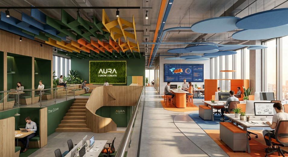
“Colors and spatial perception” are among the most important design elements in the field of interior architecture that directly influence user experience. Colors not only determine the aesthetic appearance of an interior space but also shape how individuals perceive, feel, and experience that space.
The characteristics of colors, such as hue, saturation, and brightness, play a decisive role in whether a space is perceived as large or small, warm or cool, bright or dark.
Therefore, in interior architecture, color selection is not considered merely a decorative decision; rather, it is evaluated together with various design criteria such as “spatial perception,” “psychological impact,” “functionality,” and “user comfort.”
A well-planned color composition can make a space appear larger, higher, more spacious, or more intimate without changing its physical dimensions.
Furthermore, when evaluated together with natural and artificial lighting, material textures, and surface qualities, colors become one of the fundamental components that create the identity of a space.
In this context, the relationship between “colors and spatial perception” plays a significant role in the interior architectural design process, contributing both aesthetically and functionally to the creation of ergonomic, sustainable, and user-oriented living environments.
The Importance of Color and
Spatial Perception in Interior Architecture
In the discipline of interior architecture, “color” is not regarded merely as an aesthetic element; it is also an important design tool that directly affects how users perceive a space.
Colors, as one of the elements that create the identity of an interior environment, are among the fundamental components that influence individuals’ psychological states, behaviors, spatial experiences, and levels of comfort.
For this reason, interior architects make color selections not only based on visual preferences but also by considering criteria such as “spatial perception,” “user experience,” “functionality,” and “ergonomics.”
Through the conscious use of colors, small spaces can appear larger, high ceilings can feel more balanced, and cold environments can be transformed into warmer and more inviting atmospheres.
This demonstrates that color is not simply a decorative element but a powerful design tool that changes the way a space is perceived.
Formation of
Spatial Perception
“Spatial perception” is the process through which individuals perceive their physical environment through their senses and mentally interpret it.
When people enter a space, they first evaluate visual elements such as light, color, texture, form, scale, and material.
As a result of this evaluation, a mental impression is formed regarding whether the space feels large or small, warm or cold, intimate or formal.
From the perspective of interior architecture, colors play a significant role in the formation of this perception.
Two spaces with identical physical dimensions can be perceived as completely different volumes simply through different color applications.
Therefore, spatial perception is shaped not only by physical dimensions but also by the visual effects created by colors.
Color Psychology and
User Experience
In interior design, “color psychology” is an important field of study that influences users’ emotional states.
Each color creates different psychological effects on individuals. While warm colors generate feelings of energy, movement, and vitality, cool colors support feelings of calmness, peace, and relaxation.
For this reason, interior architects consider not only aesthetic concerns but also how users will feel within a space when designing interiors.
For example, colors that enhance concentration are preferred in workspaces, while relaxing tones are selected for resting areas.
Thus, color becomes an essential design component that strengthens user experience and supports the function of a space.
The Effects of Light and Dark Colors on
Spatial Perception
One of the most commonly used design strategies in interior architecture is benefiting from the effects of “light” and “dark” colors on spatial perception.
Light colors reflect more light and make spaces appear larger, brighter, and more spacious. White, cream, and light gray tones are especially preferred in narrow spaces to help users develop a more comfortable perception of the environment.
In contrast, dark colors absorb light, causing spaces to be perceived as smaller, more intimate, and more controlled.
In large-volume spaces, the use of dark tones can reduce the feeling of emptiness and create a warmer and more balanced atmosphere.
Therefore, color selection is a powerful design tool capable of changing the perception of volume without altering physical dimensions.
The Spatial Effects of Warm and
Cool Colors
“Warm colors” and “cool colors” are consciously used in interior architecture to create spatial depth.
Warm colors such as red, orange, and yellow tend to appear closer to the viewer.
Therefore, warm colors can be used in large spaces to create more intimate and inviting atmospheres.
Cool colors such as blue, green, and purple are perceived as receding and can make spaces appear larger than they actually are.
Especially in small residences and narrow offices, light blue or light green tones can positively influence the perception of space.
Interior architects utilize these characteristics to develop spatial solutions that meet user needs.
The Relationship Between
Light and Color
In interior design, the effect of colors does not result only from their own characteristics; it must also be evaluated together with lighting conditions.
The same color may be perceived differently under daylight and artificial lighting.
Warm yellow-toned light sources make colors such as red and orange appear more vivid, while white lighting enhances the visibility of blue and gray tones.
Therefore, interior architects consider the amount of natural light a space receives throughout the day together with the artificial lighting systems when selecting color palettes.
When harmony between light and color is achieved, the aesthetic value of the space increases and user satisfaction improves.
Material and
Color Harmony
The effect of colors on spatial perception is directly related to the materials used.
Wooden surfaces create a sense of natural warmth, while metal surfaces create a more modern and cooler perception.
The same color can produce completely different effects depending on the material applied.
Dark colors on matte surfaces create a calm and sophisticated appearance, whereas the same colors on glossy surfaces appear more dynamic and attention-grabbing.
In interior architecture, a successful design is achieved not only through choosing the right color but also by supporting it with the right materials.
The Role of Colors in
Creating Spatial Identity
Every interior space has its own unique “identity,” and colors contribute greatly to the formation of this identity.
Color preferences vary according to user expectations in spaces with different functions, such as residences, hotels, restaurants, educational buildings, and healthcare facilities.
A restaurant can become more appetizing through the use of warm colors, while a hospital can create a sense of hygiene and trust through light tones.
In educational buildings, vibrant colors can increase learning motivation, while balanced neutral tones in offices can support concentration.
Thus, colors stand out as one of the fundamental design elements that define the character of a space.
Color Contrast and
Visual Hierarchy
In interior architecture, the principle of “contrast” is an important design method that helps users navigate within a space.
Through the balanced use of light and dark colors, focal points can be created.
Entrance areas, circulation paths, staircases, or specific furniture pieces can be highlighted with contrasting colors, directing users’ attention to desired areas.
At the same time, the use of contrast prevents monotony and makes a space appear more dynamic.
However, excessive contrast may cause visual fatigue; therefore, interior architects focus on creating a balanced color composition.
The Effects of Colors on
User Behavior
Colors influence not only visual perception but also user behavior.
Studies indicate that warm tones can increase social interaction, while blue and green tones can support attention and concentration.
For this reason, calmer color palettes are preferred in libraries, educational buildings, and workspaces, while more dynamic color compositions are used in social areas.
Successful interior design becomes possible through appropriate color choices that support user behavior.
The Use of Color in Sustainable
Interior Architecture
Today, within the understanding of “sustainable design,” color selection is evaluated not only from an aesthetic perspective but also in terms of energy efficiency.
Light-colored surfaces reflect daylight more effectively and can reduce the need for artificial lighting.
This contributes to lowering energy consumption.
Additionally, preserving the natural colors of natural materials supports environmental sustainability and helps users establish a stronger connection with nature.
Thus, color becomes an important component of sustainable design.
Conclusion: Color Clarifies and
Strengthens Spatial Perception
In conclusion, “color” in interior architecture is not merely an aesthetic preference; it is a fundamental design tool that shapes “spatial perception,” “user psychology,” “functionality,” “comfort,” and “spatial identity.”
Light and dark colors influence the perception of volume.
Considering the psychological effects of warm and cool tones, their relationship with light and materials, their ability to guide user behavior, and their contribution to sustainable design, the importance of colors in interior architectural applications becomes increasingly clear.
A successful interior design should not only be visually impressive but should also enable users to experience spaces in a more comfortable, functional, and meaningful way.
Achieving this goal through the conscious and scientifically informed use of colors continues to be one of the essential design approaches in the discipline of interior architecture.
Aydın Yıldız
Brand Consultant
For modern, aesthetic, functional, and comfortable design, project, and implementation solutions, let’s get in touch now for the best interior architecture design ideas, project quotations, and turnkey interior design solutions.